Silestone Brochure
Silestone owes its success to its people: a diverse, strong workforce distributed in more than 20 countries and comprehensive distribution centers and service platforms across the globe.
To design an elegant sales brochure that would help Silestone communicate behind the company's successes and leadership lies a global team united across borders towards a common goal: Consistently delivering innovative kitchen products.
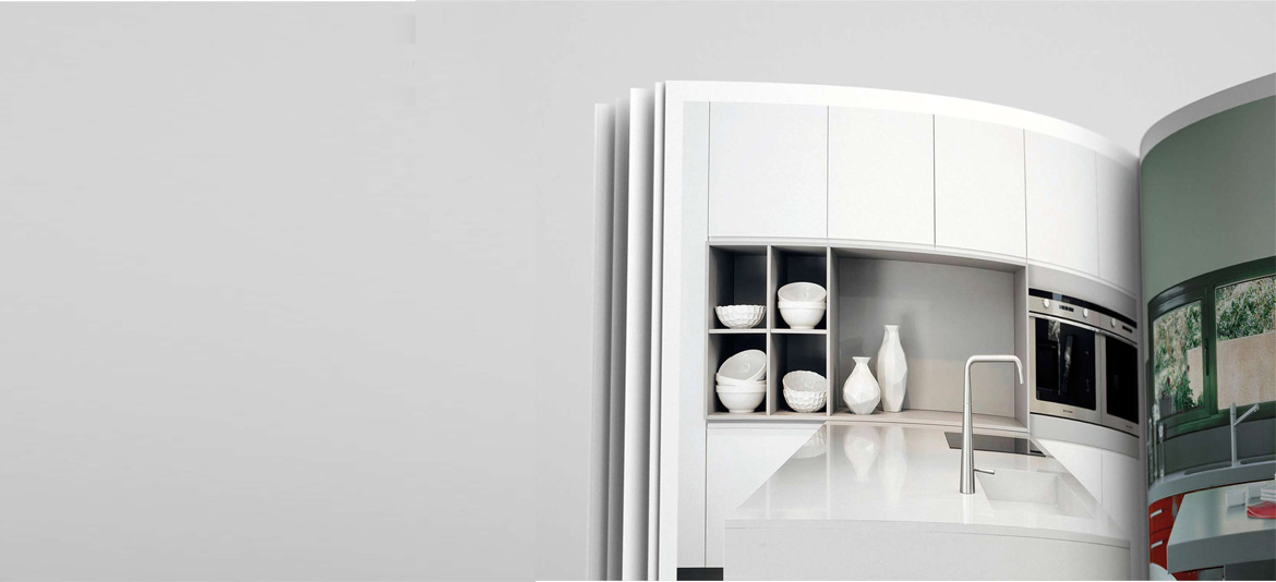
The simplicity of the cover design—clean and elegant—creates immediate impact and generates curiosity. The color is restricted to the brand's red on a fixed spread with a mixture of serif and sans serif fonts to identify the brand's message. Page after page inside, the brochure design is filled with stunning color tones and elegant photography that bring out the complexity behind the Silestone product performance. The style and tone are consistent with Silestone's website, which I was also involved with in the design.
The sales brochure includes detailed product information and includes over 60 colors of different surface textures highlighted with unique icon designs.The sales brochure is full of personality—the perfect combination of engaging and memorable imagery and laid out information. The significantly large font use and its simplicity of color use help make a strong and confident statement about the company's passion and commitment to deliver the best solutions for its customers and make a difference to the kitchens of customers all over the world.