Cafe Diario

Cafe Diario believes that coffee is an open invitation. That good coffee is for everyone and not just the coffee elite.

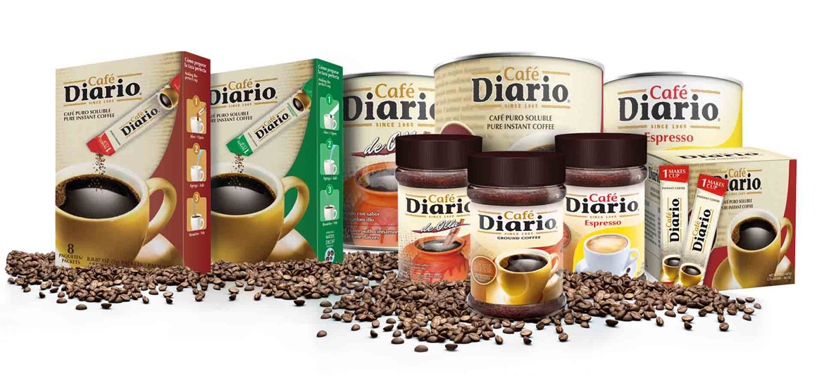
They dig deep to roast and find the absolute best coffees. The company had the pleasure of extending its existing products with new packaging designs for its coffee labels.
The challenge was to come up with a package that would once again stand out from the crowd. Just like coffee, even its packaging design should also be enticing and attractive. The coffee packaging design should link by visual language based on typographic simplicity and overall creativity.

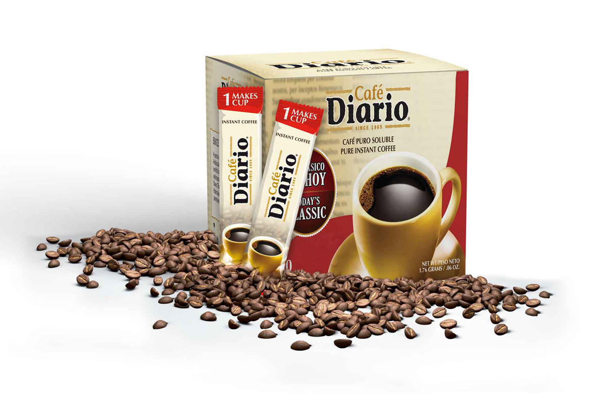
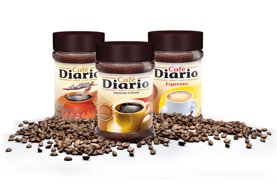
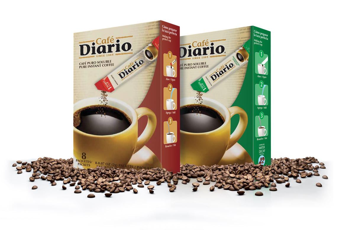
In the design, the logo is front and center for greater brand recognition—and a coffee cup highlights the coffee packaging. We developed an appealing coffee label and packaging for each of its blends. In the design, the logo is front and center for greater brand recognition—and a coffee cup that highlights the product. The label educates the customer about coffee as passionate coffee lovers are in trust for information.

The new designs redefined Cafe Diario as a serious contender in the grocery store's coffee aisles and allowed for consistent branding across multiple products. The packaging spoke for the quality of its contents and each of its products.
