

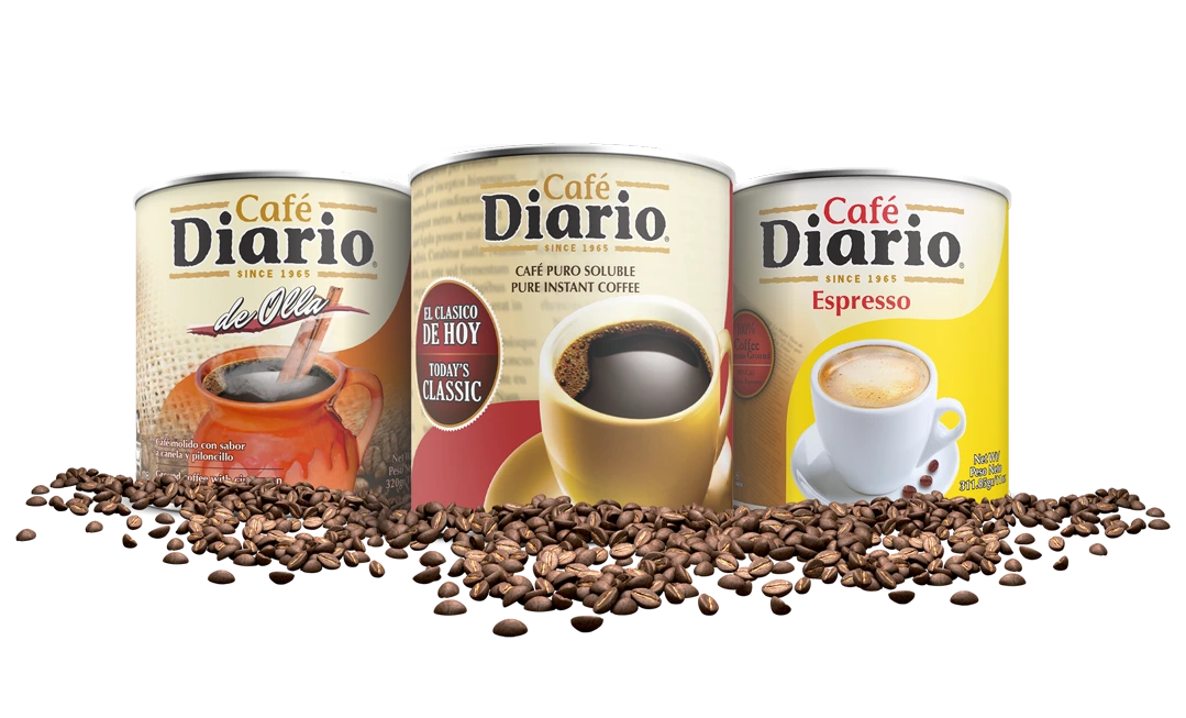
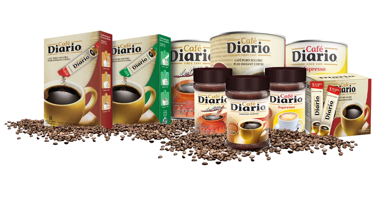
Café Diario had loyal customers but a fragmented look. Identity, labels, and print pieces came from different vendors—colors drifted, typography shifted, and packaging wasn’t retail-ready. The brand needed a consistent system that could scale SKUs, shorten print cycles, and cut unit costs.
Symptoms we found
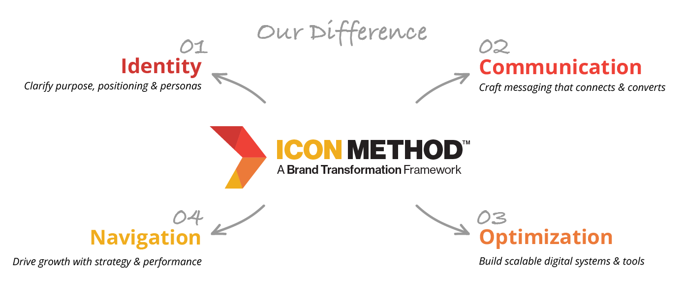
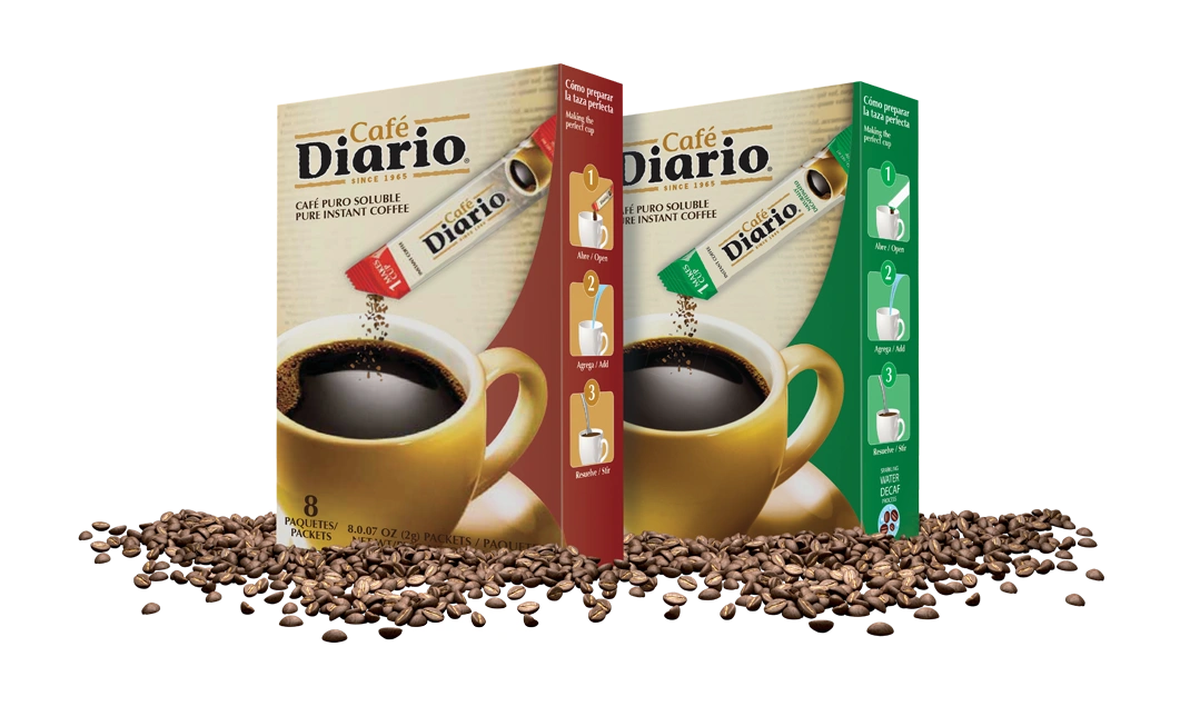
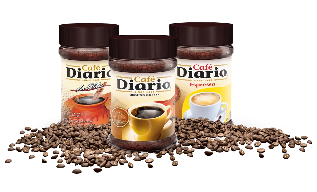
We ran a focused ICON sprint that locked a unified identity (logo suite, color standards across Pantone/CMYK/RGB/HEX, retail-legible type hierarchy), engineered master dielines with SKU color logic and variable data fields, and published a vendor-ready print spec pack (substrates, coatings, ink/varnish layers, barcodes, preflight checklist, RFQ template)—so packaging scales cleanly across sizes and seasons while reducing rework, shortening print cycles, and lowering unit cost.
What we offered
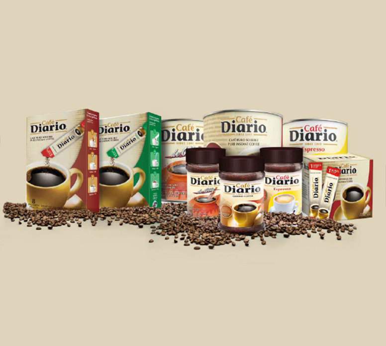

A consistent identity and packaging system that scales SKUs without redesign. We standardized color, type, and dielines; reduced print rework; and cut unit costs by selecting better substrates and finish tiers.
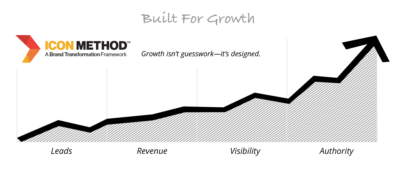
Post-launch performance (replace with verified numbers as they accumulate).

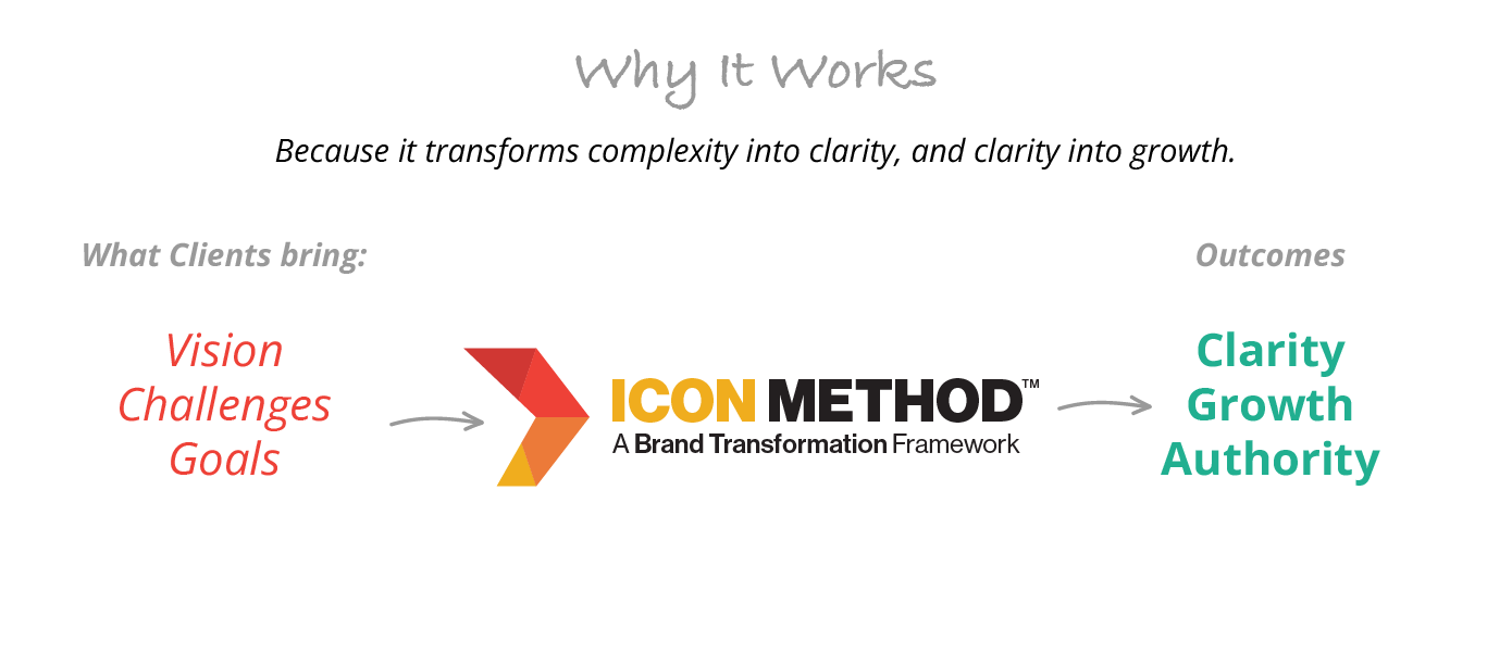
We don’t just design brands—we transform them. Through the ICON Method, we align strategy, identity, and execution to spark measurable growth. More than a studio, we’re your partners in building clarity, consistency, and momentum.