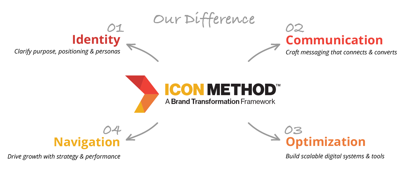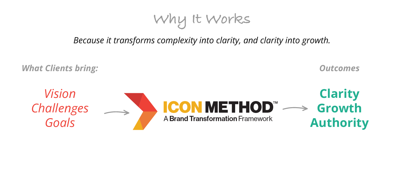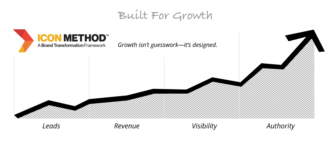
Grow across retailers with a brand that reads cohesive—from hero SKUs to long‑tail variants. Multiple legacy layouts created drift in color, claims, and hierarchy.
What we found
Rebrand core identity, then codify packaging. We created a flexible visual language and a standards manual that translates consistently across all existing products.
Delivered


A brand‑wide system. One identity, one grid, one rulebook—applied to every existing product so packaging looks and works like a family.


Consistency in branding across all packages. The standards manual and dielines library keep every SKU on‑brand and retail‑ready—simplifying seasonals and retailer exclusives.

We don’t just design—We systemize. Your brand stays consistent as the line grows, with files vendors love and timelines your team can hit.
