
Case Study · Muscle Rehab
Award-WinningHow clarity-first packaging turned a crowded-category product into a $700K+ profit engine
Athletic recovery is a saturated category where vague wellness language kills trust in seconds. Abstract Creative built Muscle Rehab's brand, messaging, and packaging as a single system — engineered for 3-second comprehension at shelf and online, and the numbers followed.
Client
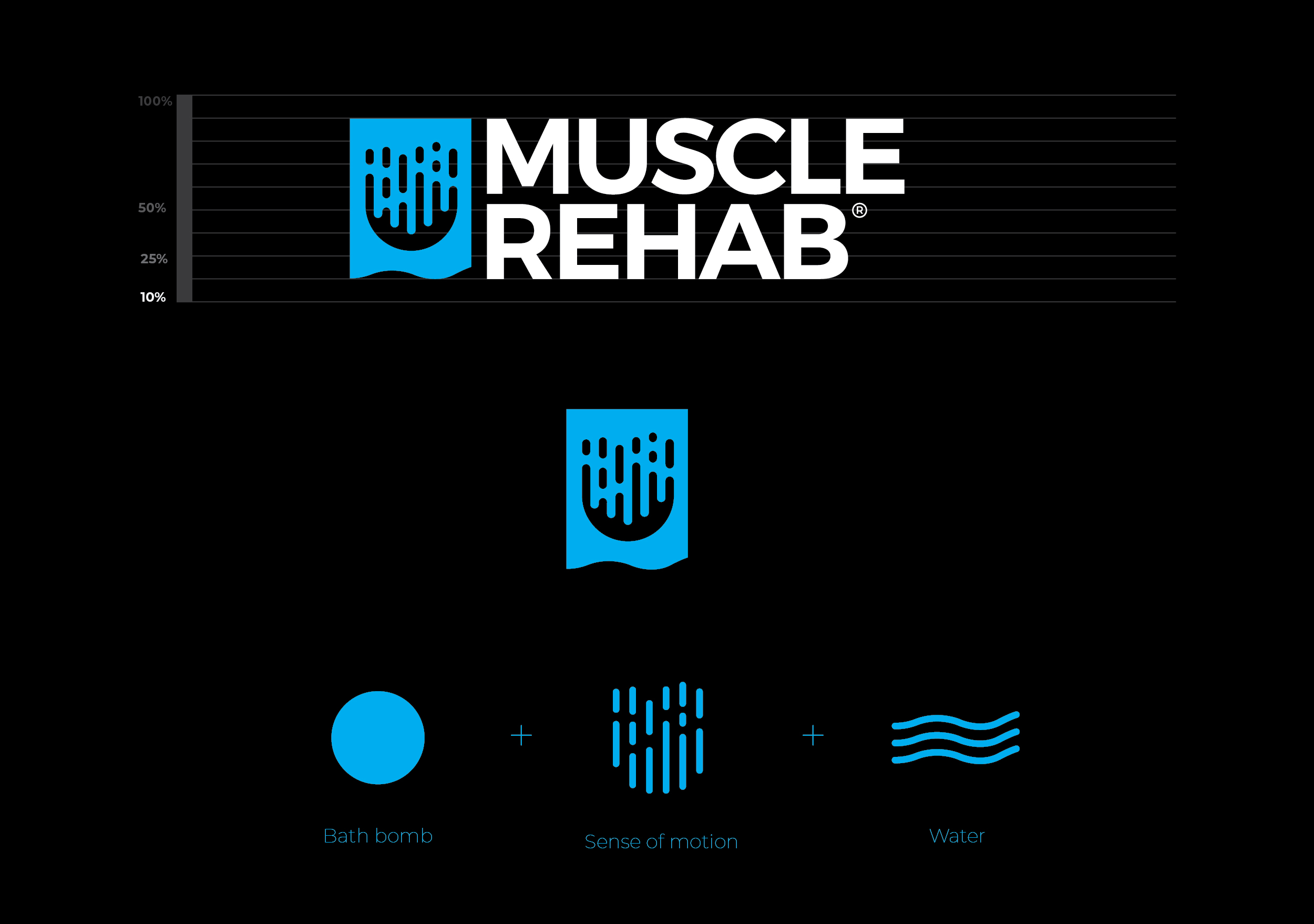
Muscle Rehab
Sector
Consumer Product · Athletic Recovery
Engagement
Brand · Packaging · Messaging
Framework
ICON Method
The Problem
A working product killed by three seconds of silence — vague wellness language that signaled low efficacy to serious athletes in a saturated category.
The Positioning Move
Rebuilt brand, messaging, and packaging as one system engineered for 3-second comprehension — proving efficacy before a buyer reached for a competitor.
The Measured Result
$700K+ cumulative profit since launch (client-reported) and an estimated +40–50% conversion lift — with no discounting.
In a saturated category, ambiguity is a death sentence
The athletic recovery market is flooded with products leaning on lifestyle imagery and vague wellness language — "feel better," "recover faster," "natural ingredients." For serious athletes, that language signals one thing: low efficacy. They move on in seconds.
Muscle Rehab had a product that worked. What it didn't have was packaging that could prove it before a buyer picked up a competitor. The problem wasn't the product — it was the three seconds of silence before anyone understood what it was for.
The Core Insight
"If the benefit isn't obvious in under three seconds, the sale is already lost."
One positioning standard. Every element built from it.
Before a single design decision was made, Abstract Creative locked the positioning: fast, effective recovery for people who train hard. That single standard governed everything — messaging, identity, packaging hierarchy, and visual language.
The brand was built before the packaging existed
Logo, mark, and identity system were locked first — before a single packaging decision was made. This meant every surface the brand touched, from shelf to screen, spoke from the same visual language from day one.
Packaging hierarchy engineered for 3-second decisions
Primary benefits were elevated above secondary information — the opposite of what most recovery brands do. The result: buyers could assess, decide, and reach for the product without reading a word of body copy.


Performance language replaced wellness vagueness
Every word on the packaging was pressure-tested against the athlete buyer's mindset. Specificity over inspiration. Efficacy over lifestyle. The tone said "this works" before the ingredients list said anything.

Identity and packaging built as one system, not two projects
Logo, typography, color, and packaging structure were developed simultaneously, not sequentially. This meant the brand identity was native to the product format, not adapted to it after the fact. Shelf presence and digital presentation were cohesive from day one.


Clarity at the shelf translated directly to profit
Post-launch performance showed an estimated 40–50% lift in conversion rate, driven by packaging that removed hesitation at the moment of decision. Buyers understood the product faster, trusted it sooner, and came back — repeat purchases increased by an estimated +30% as product comprehension improved at first exposure.
Critically, this growth happened without aggressive discounting. The brand held its price position because the packaging justified it. Cumulative profit crossed $700,000 post-launch — a result driven not by ad spend alone, but by a brand system that converted at every touchpoint it appeared.
Conversion and repeat purchase figures are estimates based on client-reported data. The $700K+ profit figure is client-reported. Results will vary by distribution channel and market conditions.
Confidence at the moment of decision
Most consumer product brands design for aesthetic appeal and hope buyers figure out the rest. Abstract Creative designed Muscle Rehab's packaging to answer the athlete's three unconscious questions in sequence: What is this? Is it for me? Does it work? All three answered before the product leaves the shelf.
That's not a design achievement. That's a sales infrastructure built into a box.
What is this?
Is it for me?
Does it work?
Identity and Communication phases executed in sequence — positioning locked before a single design decision was made. The result is a brand system that can extend across new product lines without drifting from the original positioning anchor.
Café Diario
Premium brand and packaging system that enabled a 155% price increase and 120% revenue-per-unit growth.
See how we built Café Diario's brand identity, positioning, and packaging for instant shelf credibility.
