
Not because it looks bad. In fact, the websites I audit most often look quite good. Professional photography. Clean layout. Thoughtful typography.
But they are not converting. And the founders who own them are confused, because they invested real money in the design and the results are not there.
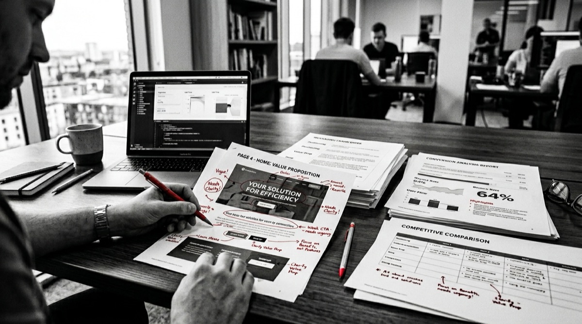
Here is the diagnosis I give almost every time: the design is fine. The messaging is broken.

Every prospect who lands on your homepage is running an unconscious evaluation in the first five seconds. They are asking themselves three questions:
If your homepage does not answer all three of those questions before the first scroll ends, they leave. Quietly. Without telling you why. And your analytics show a bounce, but not the reason.
The reason, almost always, is that the messaging was written from the inside out. It describes what the company does from the company's perspective — capabilities, services, credentials — instead of what the prospect needs to hear from their perspective.
Design is the container. Messaging is what fills it. And no container, however beautiful, will hold what was never put inside.
I want to be clear about what I am not saying. Good design matters. It builds trust instantly. It signals professionalism before a word is read. A well-designed brand absolutely converts better than a poorly designed one, all else being equal.
But all else is not equal when the messaging is unclear.
When a prospect cannot immediately see themselves in your story — when the headline describes your methodology instead of their transformation, when the about page talks about your journey instead of their problem — the design becomes irrelevant. No amount of custom photography or clever animation will hold someone on a page that is not speaking to them.
When I audit a website at Abstract Creative, I am looking at three connected layers:
Most websites have partial versions of the first layer and almost none of the second or third. They generate interest and then let it dissolve, because there is no system on the back end to capture it. More marketing spend will not fix this — the gap is structural, not budgetary.
A website that converts is not necessarily more complex than one that does not. In fact, the best-converting sites I have built for clients are simpler. Fewer words. Clearer hierarchy. More intentional use of every element on the page.
What makes them work is that every sentence was written to do a specific job. The headline names the prospect's transformation. The subhead explains the mechanism. The body copy addresses the objection. The CTA removes the friction.
And behind it, an automation infrastructure that ensures no one who expresses interest falls through the cracks.
I offer something I call a brand audit for growth-stage businesses. In 60 minutes, I look at your messaging, your positioning, and your site structure and tell you exactly where you are losing people.
Not a vague assessment. Specific, actionable findings about what is working, what is not, and what to fix first.
Most founders walk away from that conversation with more clarity about their brand than they have had since they started the business.
You do not need a new website. You need the right message on the one you have. And if your business is in a growth phase, it is worth understanding why brands break down between $500K and $5M — because the messaging problem is almost always a symptom of a deeper brand architecture gap.
Client Results
“Efren didn’t just design assets — he built a cohesive brand system that elevated how my business shows up everywhere. We’re regularly asked where our branding came from.”
Sebastian Millan
CEO, TMS — Tools, Materials & Supplies
“He has a rare ability to anticipate client needs proactively, which made the collaboration seamless and efficient. His attention to detail is evident in every deliverable. I highly recommend his services.”
Cathy Torres
CEO, Stamped Passport Society
“This wasn’t just branding — it was business transformation. Website, automation, first campaign — now we feel unstoppable. Our close rate went up immediately.”
Derrick Hendricks
CMO, Grammas

Written by
Founder, Abstract Creative — Brand Transformation Studio, Houston TX
Efren works with professional services firms between $500K and $5M to install the brand infrastructure they need to scale without drift — positioning, architecture, conversion systems, and growth channels built in the right sequence.
Free Download
The complete walkthrough of all four brand pillars — with assessment questions and failure patterns for each. Free, no fluff.
Get the Free BlueprintExecution Service
The Execution service rebuilds your web presence around positioning and conversion — so the site earns its keep instead of just existing.
Book a 30 minute conversation. We'll look at your messaging, positioning, and site structure and tell you exactly what to fix first.
Not sure where your brand stands? The free assessment identifies your weakest pillar in 5 minutes.
Take the Free Assessment →