
Case Study · Kinsmen Group
Modernizing the Kinsmen Group brand and digital experience for enterprise buyers.
Kinsmen Group had established a strong reputation helping asset-intensive organizations manage engineering information. As the company evolved, the brand and website were refreshed to better reflect Kinsmen's expertise, strengthen consistency across channels, and provide prospective customers with a clearer understanding of its capabilities.
Client
Kinsmen Group
Sector
Industrial · Digital Transformation
Engagement
Brand System · Web · Positioning
Framework
ICON Method — Full Sequence
As Kinsmen Group evolved, their brand needed to evolve with it.
Kinsmen Group helps asset-intensive organizations modernize and transform their engineering and industrial information ecosystems—a market where buyers are risk-averse, decisions involve multiple stakeholders, and credibility is established long before a sales conversation takes place.
As Kinsmen continued to grow, the brand was being applied across an increasing number of digital and sales channels. The opportunity was to create greater consistency in how the company's expertise, services, and value were communicated. By refining the visual identity, messaging, and website experience, prospective customers could more easily understand Kinsmen's capabilities and evaluate whether the company was the right fit for their needs.
The brand was built before the website existed
Building on the existing Kinsmen Group identity, the team established brand standards and visual guidelines before website development began. This helped create greater consistency across digital experiences, sales materials, and future marketing initiatives.

Built on the ICON Method — identity first, execution second
Before website development began, Kinsmen and Abstract Creative worked together to refine key messaging, establish brand standards, and document guidelines for consistent communication. The resulting framework provided a foundation for visual and verbal execution across digital channels and sales materials.
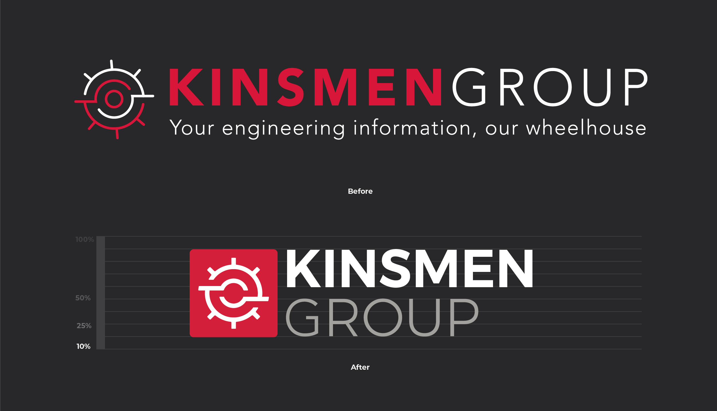
Logo system rebuilt for greater flexibility across digital applications.
The mark was refined to improve clarity and authority across desktop, tablet, and mobile — ensuring credibility was never lost at the wrong screen size during a buyer's evaluation process.

Positioning and tone of voice formalized
Key messaging and positioning were refined and documented to create greater consistency across marketing and sales communications. The updated language focused on clearly communicating Kinsmen Group's expertise, services, and value proposition to prospective customers.
Service pages designed to support enterprise evaluation.
Website content was organized to help prospective customers better understand Kinsmen's capabilities, experience, and areas of expertise. The structure emphasized clarity, credibility, and consistency across the digital experience.


The website was designed to support the customer journey.
The redesigned website provided Kinsmen with a more consistent and professional digital presence, bringing together updated messaging, visual standards, and service information into a cohesive experience. The result was a platform better equipped to support marketing, sales, and future growth initiatives.
Every deliverable was built on top of that foundation, resulting in a more consistent and cohesive experience across the Kinsmen brand.
"Efren has supported Kinsmen Group through multiple stages of growth, always bringing creativity, professionalism, and a strong commitment to the success of each project. He is easy to work with, receptive to feedback, and genuinely invested in delivering work that reflects the needs of the business. We value the relationship we've built over the years and appreciate his contributions to the Kinsmen brand."
Jessica Bianchessi
Co-Founder & VP, Sales & Marketing · Kinsmen Group
"Efren and I did the website revamp for Kinsmen Group. Remotely, we made a beautiful site, using his artistic website design skills and my wordsmith abilities. He is concise, methodical, and a dream to work with. If I could clone a colleague, it would be Efren."
Camille Todaro
UX Writer & Content Strategist · Collaborated on the Kinsmen Group web project
This engagement followed the full sequence — Identity, Communication, Optimization, Navigation, in order. Positioning was locked before any design decisions were made. Every deliverable that followed inherited that clarity. The Kinsmen results reflect what happens when the sequence isn't skipped.
Muscle Rehab
Brand, positioning, messaging, and packaging that fueled $700K+ in cumulative profit for an athletic recovery product.
See how we repositioned Muscle Rehab with conversion-focused packaging and messaging.
